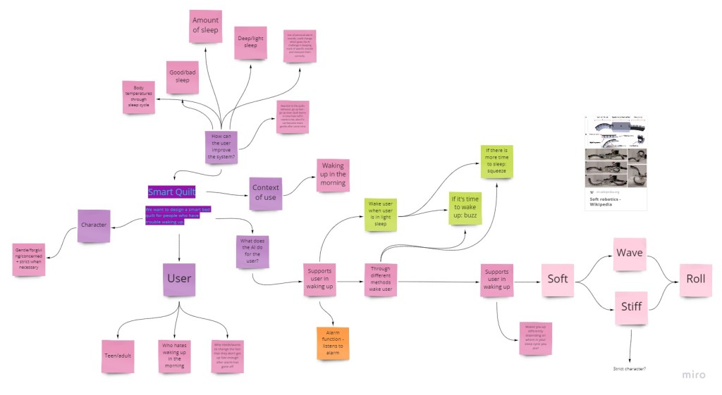
Data Physicalisation and starting point of the project

We have started the process of brainstorming for this week’s project. Even though we were given some examples and options to choose from for our topic, after discussing it in our group, we all realized the design space is very broad and choosing a topic would take a lot of time. Some predictable ideas were brought up e.g. racism, gender inequality, stress and mental health, anorexia and body image, and so on, which could be intellectually and culturally critical and provoking. But we decided to throw some ‘fun’ ideas in the mix as well, therefore we came up with “bizarre causes of death”, but then other ideas came up, in which we saw more potential. Afterall, we have to choose something that we could find legitimate and enough statistics and information about, for the design to be informative. But it also has to be provocative in a way.

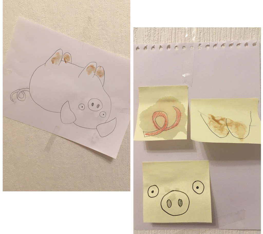
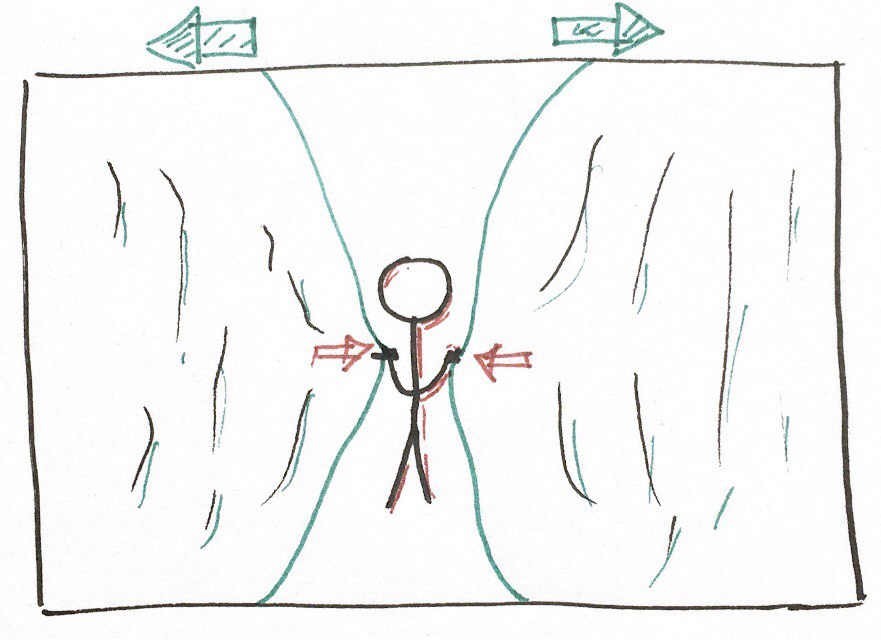
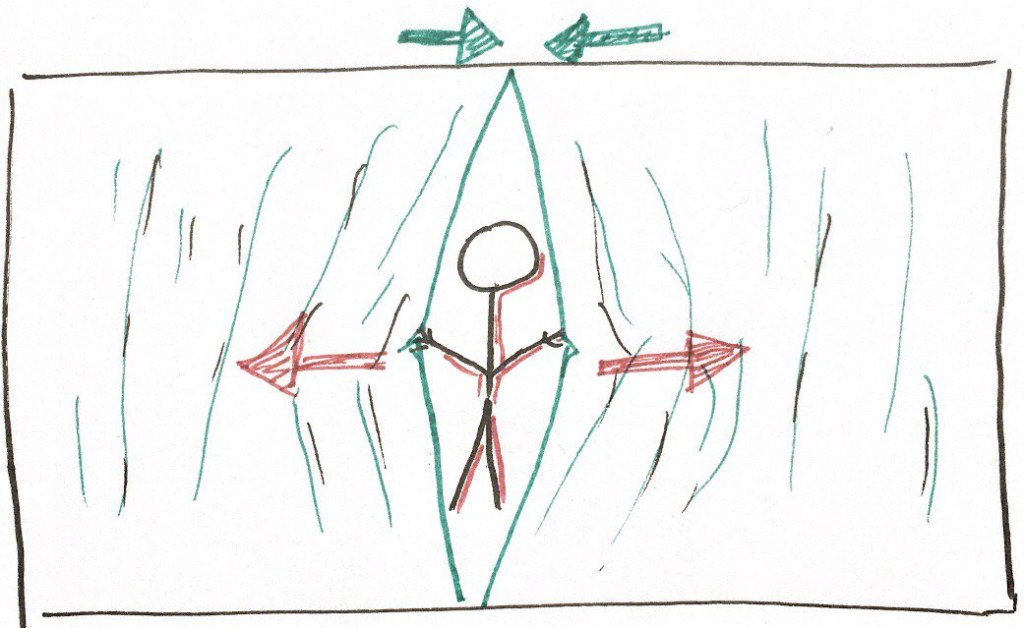
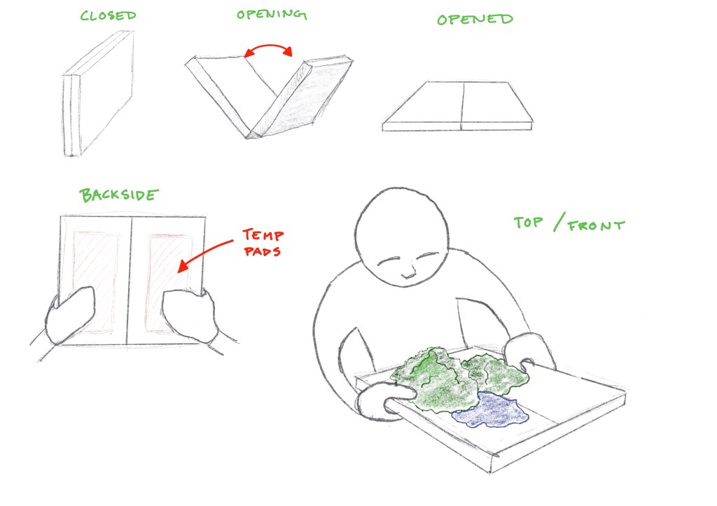
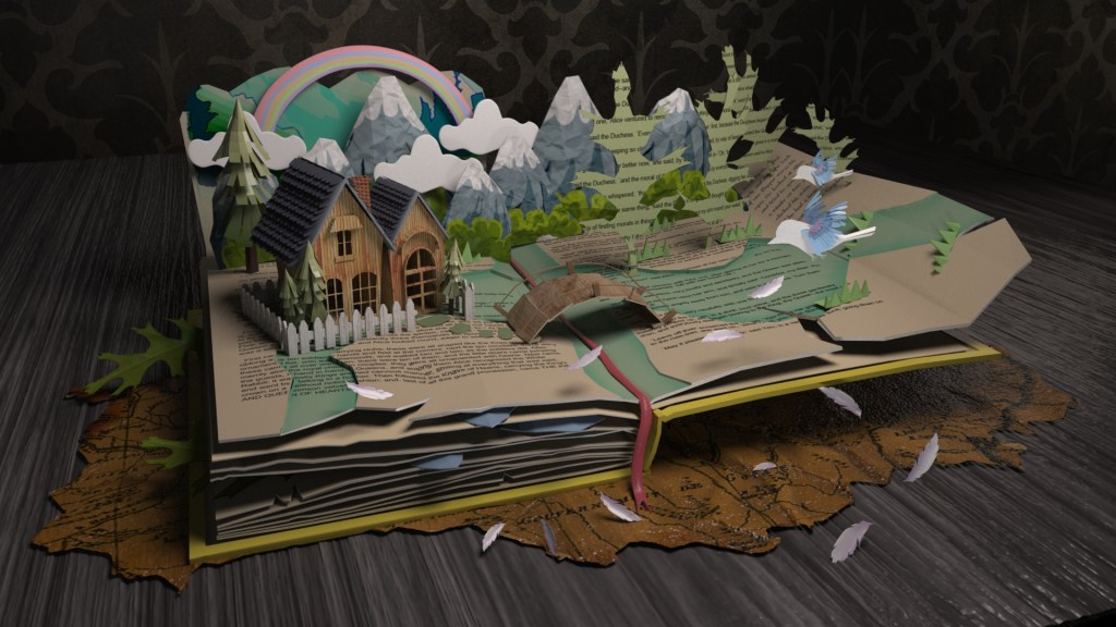
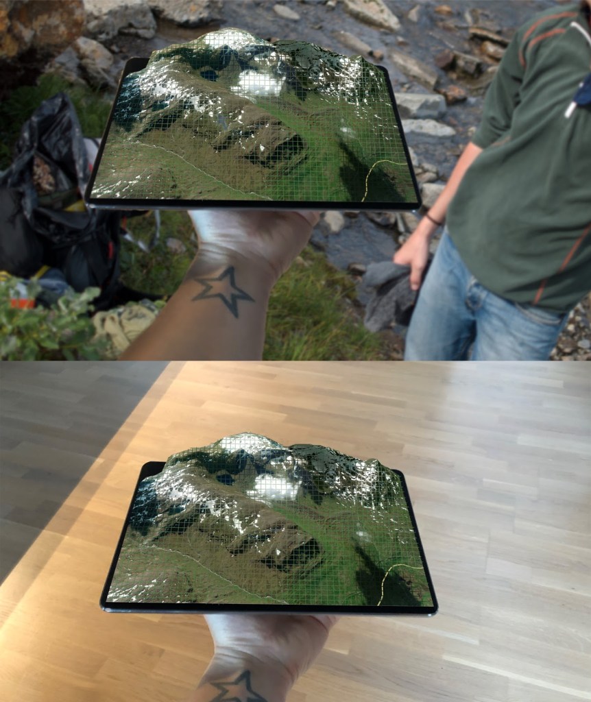
We had several potential ideas that we discussed on a deeper level, e.g. one idea we had that I was particularly intrigued about was about the level of democracy in different countries; we wanted to take the relevant statistics and make an interactive “canvas”, two people would sit in front of the canvas, each of them facing one of the sides of the canvas and start to talk, the canvas should be “transparent” for them to be able to talk, but the transparency would depend on the level of the democracy in the specific country the users choose on the canvas. This would lead the users to experience the intensity of the censorship present in a lot of countries. Although we were excited about it, we were not sure about the technology we could use for the canvas to make this happen so we dropped it. Lastly, we ended up with an idea of a map for hikers that would show you the paths, the weather forecast, the angle of the slopes, etc. all through data physicalisation. The “map” would be shaped like a closed book initially, which can be opened up and it would have the 3D physicalisations of the environment the user is in, deriving from the “pop-up” books we all had as children. The overall size of it would be like a regular iPad, for it to be handled by hands, and actually give the feeling of a typical map.

the basic physical shapes and attributes of the object

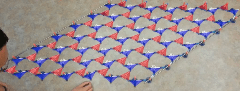
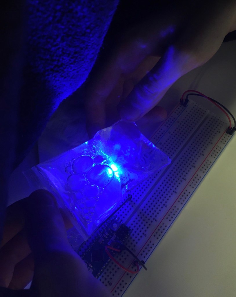
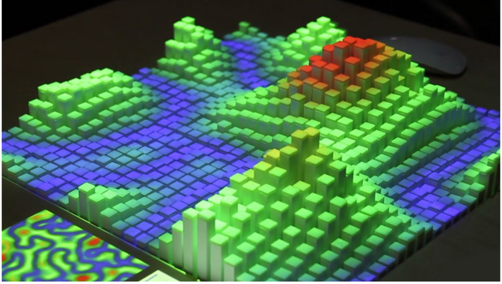
The technology that could possibly be used for the topography and the actual physicalisation of the environment is the one mentioned as one of the examples in the paper by Jansen et al. (2015) [1].

data physicalisation from MIT Media Lab, taken from [1].

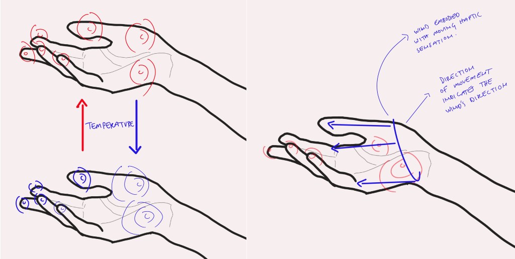
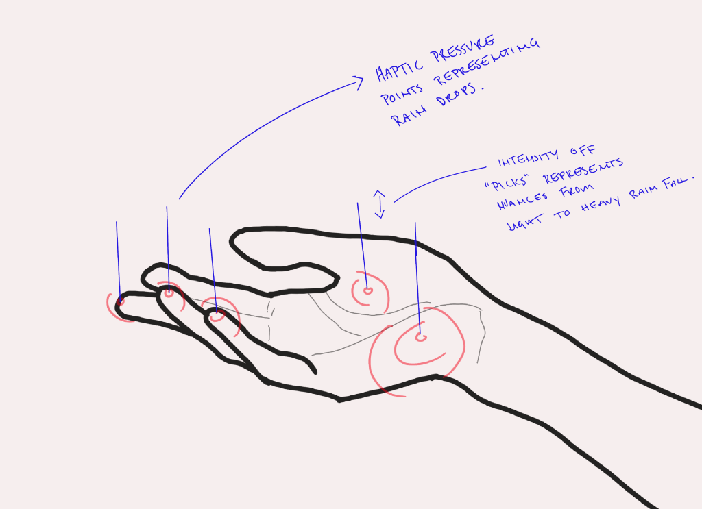
To elevate the level of physicalisation, we decided to have temp pads below the map, and also some sort of haptic feedback to indicate if it’s raining, etc.

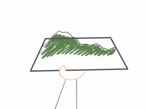
After discussing the ways the user could control the “map”, we realized we were being too much in the details of it for a project we have only a few days for, so we decided to take a step back and reconsider whether the concept was fun enough for us. Instead of having the “map” being more of a functional object that would consume a lot of energy to operate, we wanted to take away from that, and focus more on the whole experience of it. So we switched to a map that would only show you the weather and the topography of your location/surroundings, and it enables you to save and store that location with all the data about the weather and the changes in the journey to later “open” it up and reminisce about it and/or show it to others. This object would provoke the user in an emotional and positive way, instead of intellectually and/or culturally. The haptic feedbacks come from the bottom of the object, where the user is holding the device. I suggested we could have different hand/body gestures (interactive) for the user to control the device. At the end, we are interaction design students and it would not hurt to think of and implement some kind of an interaction to the device. For zooming, e.g. the user could “twist” or pinch one of the physical “grids”. This way we can move away from having the typical zooming in and out gestures we have available on regular 2D displays. This could, on the other hand, minimize the intuitiveness quality of the interaction for the user, since they will have to build new skills and getting used to them, which would probably have a learning curve. The interaction could also be implemented in the part where the user wants the device to “start capturing” and then to “stop capturing”. We would not want the device to capture everything. But my idea was turned down by my teammates for the reason that they thought if we added such a feature, it would seem forced, also because of the lack of time. I personally thought the interaction of the user with the device was passive as it was. i.e. the user only opens the map up, closes it, opens it afterwards to reminisce about it, and while holding it, the data would come to her either in the form of haptic feedback or data physicalisation of the scenery.

changes in the journey
warmth/coldness and wind intensity and direction felt by the hand coming from the bottom of the device
sensation of rain with pressure (intensity of rain)

The concept we have decided to work on is not very similar to the other ideas we had in the brainstorming process, i.e. this concept is not going to need any statistical numbers and information, other than the relevant information about the weather. Another point is that the haptic feedbacks are coming from the bottom of the device which creates like a 2 in 1 function. But I asked myself after the presentation, is this 2 in 1 function actually desirable? How does that feel when the user does not want to feel the feelings and they just want to know about the scenery? So it kind of makes it a non-controllable interaction, or one that is not initiated by the user, which is going to change the user experience of the object. Another question that came to my mind after seeing other groups’ works, was that are we allowing for multiple people (when reminiscing and showing it to other people) to experience and feel the whole thing with the physical shape and form of the device? The size of the device would be like an iPad’s, and clearly, only one person could hold it, so when in a situation where the user wants to show the experience to other people, although it is possible for them to see the physical “grids” (the top of the device), but they will not be able to feel the haptics! and as a result, they will not be able to feel the whole experience as, as the device was designed to provide.

So for further development of the concept, this issue has to be addressed and acted upon, we either have to introduce the device for only personal use and not for other people to see and experience, or change the size and the affordances of the device to be suitable for a group of people to experience it. The latter I cannot logically imagine happening, because the “map” is for hikers, so it has to be at a certain size and not bigger to be portable and light weight; otherwise the concept we began with and based this object on is going to be changed.

a wizard of Oz of how it would look like. (note that the physicalisations will be less realistic than this)
Seminar and Readings

I am going to write about the interesting points I came across in the seminar here. In the paper by Jansen et al. (2015) [1], they talk about how, since the technology is moving towards more 3D and physicalized devices, we are moving far away from the regular 2D displays and computers. But we could argue that in some situations like sending/receiving a notification, having a physical interactions/physicalized data is excessive, so some things must remain as they are, i.e. synthetic.

Different benefits of data physicalisation that were not mentioned in the paper and were discussed in the seminar include “breaking” language barriers, e.g. in a museum where all the information are in a particular language that one does not know, this could be a very useful feature. In the context of museums, something else that was brought up by one of the classmates was the fact that people with disabilities cannot have a fair experience in museums and similar locations, and that this could be enhanced with data physicalisation. Another benefit could be to physicalise the kinds of information that are not understandable by regular/non-professional people, in their normal form, such as data and information that websites store from us and how they do it, for security reasons, etc. (ethical), to make them more familiar.

Regarding the second paper by Hornecker & Buur (2006) [2], the oldness of it was mentioned in the seminar and the fact that a lot of the “research areas” they have tried to introduce in the paper have already been covered and taken care of, as well as some of the technologies.

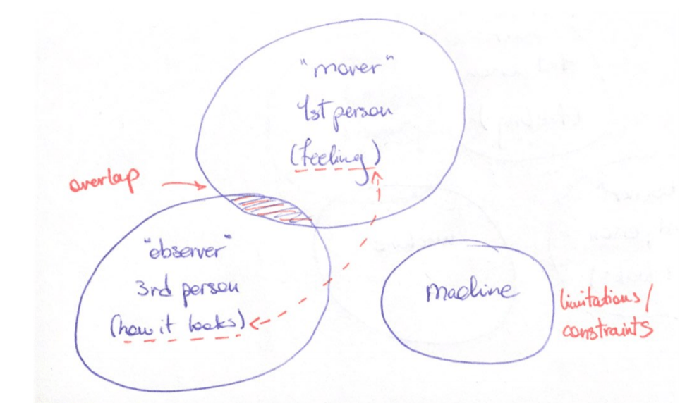
The three different main perspectives on the matter, as a point of departure.

(my own thoughts: although the collaborative aspects are mentioned in both of the papers, we, in our project, are not using this aspect as a self-imposed constraint in the design area, which is interesting. Of course, it would have been hard to test it out in these times of pandemic, but I am very intrigued about this matter.)

Something that was mentioned in the seminar while talking about this paper was that, although frameworks are useful for analytical, iterative, etc. purposes, we as designers should not limit ourselves to frameworks, and we have the ability to change or evolve them. Another point was about how this framework is useful in the context of designing everyday use AI object (the topic of last week), which is the relatedness of the (especially) fourth theme mentioned in the paper (Expressive Responsiveness) to that matter, maybe even the second theme.

Something I enjoyed with the seminar of this and last week, is that some questions are asked for us have a discussion and to further think about the topic in question and to actually link the knowledge we have gained from reading the papers to other topics that we have probably been introduced to in the past.

References:

[1] Jansen, Y., Dragicevic, P., Isenberg, P., Alexander, J., Karnik, A., Kildal, J., Subramanian, S., Hornbæk, K. (2015). Opportunities and Challenges for Data Physicalization. In Proceedings of the 33rd Annual ACM Conference on Human Factors in Computing Systems (pp. 3227-3236). Association for Computing Machinery.

[2] Hornecker, E., Buur, J. (2006). Getting a Grip on Tangible Interaction: A Framework on Physical Space and Social Interaction. In R. Grinter, T. Rodden, P. Aoki, E. Cutrell, R. Jeffries, & G. Olson (Eds.), Proceedings of the SIGCHI Conference on Human Factors in Computing Systems (pp. 437-446). Association for Computing Machinery. https://doi.org/10.1145/1124772.1124838

Artificial Intelligence in IxD

Artificial intelligence may sound like an abstract area that only engineers and researchers deal with, at least that is how I felt about it until recently. However, we as normal citizens, come into contact with this matter on an everyday basis, when doing online shopping or browsing e.g. Netflix. In this week, we are working in AI in the context of everyday smart objects.

Readings and seminar

In this section, I will talk about some of the points I found interesting in the papers.

One point I realized after reading Computational Composites [1], was the huge difference between a design ‘tool’ and a design ‘material’ and how it can be confusing. I wonder if there are any cases where something is a material and a tool at the same time in a specific design process. What is the main difference between these two terms on a more general level? Maybe the fact that tools, as used in a process, remain unchanged after the process, so they are used to achieve something. Whereas materials are used and changed after the process is done, they are either mixed with something else, or some of their properties get changed. Something like a pen when writing something, although the ink of it gets used in the process of writing, but does that change the essence of the pen? This point was also discussed in the seminar. Some of my classmates were also confused about why we need to compare these “materials” on such a level that they do in the paper, and why do we even call computers a material when it is so complex (considering it a technology). When I was reading the paper, this thought never came to my mind. Maybe they have a point, but I guess it really comes down to the different terminologies and meanings behind them, in this case, tool and material, and technology. I was convinced by the authors about their argument, but I also see where these opposing thoughts could come from. We also need to consider the fact that this paper is from 2007, so it is relatively old, and in my opinion, one of the main purposes of this paper could have been to introduce this notion of using computers in design by trying to compare computers with other “regular” materials in design, pointing out the differences and the similarities to make their point. Another thing is that I come from an architecture/interior design “background” so seeing the examples in this paper about the “computational concretes” and also the “smart textiles” were really intriguing to me, specially knowing how different domains in design can be practiced together, can get combined. So reading this paper was definitely an eye opener for me.

Moving on to the second paper[2], the word “form” or “formal”, are mainly associated with the appearance of the objects, the shapes. This is not how the word “form” is used in the papers, though; with which I have a problem. Why do we have to use words that are commonly associated with something, and try to link it to something else, even if the primary association is wrong or not entirely correct. Why create confusion, where instead we could easily use another word?

Another point from the same paper is that they use the words “smart” and “intelligent” / “intelligence” a lot. But looking more closely to the three objects presented, none of them use Artificial intelligence! So they cannot learn from the user’s behavior and all they do have are sensors. This created a bit of a confusion among me and my team, which actually led to interesting discussions and better design choices.

In this paper, the authors critique some of the “smart speakers” in the market e.g. Google Home and Amazon Echo, saying their intelligence is not conveyed through their material form [2]. Me and my teammates had a discussion about this and we all agreed that, even though the point that they make is true from a design stand point, they are okay as they are (from a customer satisfaction and business stand point) for being everyday smart objects that are used in any kind of household, and they serve the purpose they were bought for.

Giving form to AI – Dave the Duvet.

After some brainstorming and evaluating the ideas we thought were related to our everyday life struggles/situations, we decided to go with a smart bed or a smart quilt, aiming to solve the issue(s) of falling asleep at night and/or waking up in the morning. This topic is specially important to consider and look into in these days that a pandemic is going on. It is hard to be on a regulated schedule in which you get enough sleep, when you are always at home. We decided to go with the smart quilt and not the bed, because imagining and discussing it among us, we saw more of a potential in the quilt for having a character than in the bed. There are some ways for the user to interact with a bed of course, but a bed’s properties can’t enable it to move so much, and therefore, they cannot respond to the user in an ‘authentic’ way, i.e., as stated by Rozendaal et al. (2018) , “using a product’s inherent structures and materials” [2], regarding helping the user to sleep or wake up (and without using the typical output of sounds or visuals).

our remotely done ideation process.

We wanted to narrow down our focus even more, so we decided to address the ‘waking up in the morning’ and ‘snoozing for too long’ issue. Our reasoning was simply the fact that the matter of ‘falling asleep at night’ is already well taken care of by a various range of digital and non-digital products.

The implementation of AI is in the object learning from the user’s behaviors and patterns in sleeping. i.e. it collects data from the user and adapts itself to be able to provide the best solutions for the user. It is also able to wake the user up when they are in the light stage of their sleep cycle. So it can monitor the sleep cycles of the user. It will know if the user had woken up during the night or not, so it will try to let the user sleep a bit more. Another point in this design is that the quilt is connected to the user’s alarm setting (of their phone). This way the quilt know when the user must wake up and will act accordingly. Something important to mention is that the quilt is not an equivalent for an alarm clock. This object is supposed to help the user get enough and quality sleep, taking their sleep cycles, at what time they have to wake up, their quality of sleep, and to what technique they respond well.

We thought of different temporal states the quilt can have, varying from the quilt being “forgiving” to it being “strict”. These can be considered as the characters we gave to the quilt to make it convey the fact that it is intelligent and that it changes its behavior in response to its user’s actions.

the quilt is being considerate and forgiving in this scenario.

Soft state: This is the primary state of the quilt that is similar to other regular quilts.

Squeeze state: This state is related to the quilt being comforting, in the situations such as when the person wakes up in the middle of the night or earlier than they were supposed to. This state can also be triggered by the user herself when they hug/squeeze the quilt. As discussed in our group, we realized there are people who are used to be hugged after they wake up in order for them to get out of the bed.

Wave state: This is a playful way for the user to wake up. It also enables the temperature to go down a little with the air flow it causes in the area of the bed, so it lessens the coziness of the night and the takes away the heat of the user’s body.

Stiff state: This is more related to the “strict” character of the quilt, causing the opposite feeling of the “soft” quilt.

Roll state: This is more of a straightforward approach to waking someone up, and it could be considered as the most strict state of Dave the Duvet, since it doesn’t have the playfulness of the Wave state.

Soft.
Squeeze.
Wave.
Stiff.
Roll.

All these states are not necessarily supposed to happen, and some of them could get skipped after the quilt has learned from the behaviors of the user. Some users get up easier when they are woken up in a way that they could jump out of the bed immediately (roll state), some need to take their time, otherwise they wouldn’t feel good afterwards.

The characters of the object make it more familiar to the user, i.e. the object acts like a concerned and loving parent who would wake their child up in the morning, sometimes gentle and, other times strict.

We tried to use the three phases mentioned in the paper [2], ‘conceptual’, ’embodiment’ and ‘enactment’ in the same order. The targeted users are people who have difficulty sleeping/waking up and want a better quality of sleep, on top of waking up on time. Regarding the embodiment phase, we had to search for existing materials and technologies that can create waves and movements in the quilt and be soft at the same time. Due to the shortage of time and working remotely, finding suitable materials for our project online was the most we could do. Therefore, I do not have much more to say about the material itself.

A potential material that could be used inside the quilt. [3]

Regarding the enactment phase, we tried to role play (in a Wizard of Oz way) the different states individually at home, with the help of someone moving a quilt for us, of course.

Feedback

One of the topics we did not mention in our presentation was what would be the situation if the user does not sleep alone and shares a bed. The quilt is a one-person sized object, so this would not be a problem. It would actually be beneficial in some cases that one partner’s alarm goes off, waking the other partner up, and then it would be their responsibility to wake the first person up.

References:

[1] Vallgårda, A., & Redström, J. (2007). Computational Composites. Computer/Human Interaction conference (CHI).

[2] Rozendaal, M. C., Ghajargar, M., Pasman, G., Wiberg, M. (2018). Giving Form to Smart Objects: Exploring Intelligence as an Interaction Design Material. Springer International Publishing.

[3] https://www.sciencealert.com/new-metamaterial-design-can-switch-from-hard-to-soft-and-back-again

Adding Smell to a game!

Me and my teammates started the brainstorming process of choosing a game to add a smell to one of its “game mechanics”. Since we are working remotely at the moment, we decided to use whatever scent/smell we have at home. We have landed on the game “draw the pig tail” which is a party game, we want to add a smell to this game for the player to use to get to the right position of the tail. In the original game, the player has to be blindfolded and has to spin around for a couple of times, and then try to, first, find the picture of the pig, and then place the tail on the right spot. We are thinking about adding a not-so-pleasant smell, just to make it funny and for it to make sense. Sniffing a pig’s “behind” where the tail is, would not smell like flowers! Something I found in home that does not have a nice smell, is apple cider vinegar. Using such a smell, would add a paradox to the whole game, i.e. bad smells normally repel us, whereas nice smells attract us. In this game, though, the player is “forced” to tolerate the bad smell and has to “look for it” to have a better chance at winning.

We had a discussion about how exactly we want the game to be, whether we want to be blindfolded or not, etc. After some thinking and talking, we decided to be blindfolded, because if not, a lot of effort should have been made to not “give away” the answers to the player. We thought of some ways to solve this problem, but then we realized it was too much work for such a short amount of time we had. Being blindfolded and trying to smell something without seeing anything is also pretty funny-looking and we thought it would make the whole experience more fun to play and to watch, plus, it would save us the problem of stains and/or colors being caused by the ingredients we were going to use. We decided to have more body parts and not just the tail, which meant using more smells in the game. This brings more “problems” we needed to take care of; e.g. picking smells that would not get confused for the other ones, they have to have similar levels of intensities so that none of them would get overpowered by the other smells, etc. We took away the “dizziness” of the original game. Now the game provides hints and cues for the player to have a chance in winning by using their sense of smell. So, the player is required to have a moderately-working olfactory system to be able to play and potentially succeed in this game. When watching the testing videos we recorded of ourselves at home playing the game, we noticed we were inevitably using our hands (sense of touch) to get to the right area where the picture or the post-it notes were located.

As far as the preparations and the set-up of the game for our experimenting, we decided to use whatever we have at home, since we are working remotely. I used ‘apple cider vinegar’, ‘rose water’ and ‘balsamic vinegar’. These are scents that are pretty strong and easy to distinguish. They were respectively for the pig’s ‘tail’, ‘eyes & nose’ and ‘legs’.

Ingredients used! *

*Note: I ended up switching to regular sticky notes with the body parts drawn on them (instead of using different colors), for the sake of the video prototype, for more clarity for the audience, and to be in sync with my groupmates’ work.

I asked my sister to put the picture of the pig wherever on the wall, and however she likes, that is why the picture is upside-down and tilted. Since I drew the picture myself, this way, I wanted to avoid my photographic memory to help me in the game, and use my sense of smell as much as possible. Another interesting point was that in the middle of the game, I came across one of the points stated in the paper by Niedenthal (2012) named ‘Adaptation or habituation’: “…our tendency to become unaware of odors to which we have been exposed over time…”[1]; so I had to stop for a few seconds to “refresh” my olfactory system. (this is also shown in the final video prototype.)

We were first thinking about having a bigger canvas to have the pig on, like a white board, but some of us did not own white boards at home so we had to be more creative. I decided to use a big piece of cardboard, tried to put it up on the wall but could not succeed. So I decided to stick with a few pieces of paper and some post-it notes. This makes the game itself more family-friendly, since it uses equipment and smells that are available in every household.

Final video prototype!

Final Feedback

The feedbacks were all positive. Some of the points that were mentioned included the differences between the way we did the tests, and having the same game at a party with a lot of people as spectators that would most probably cheer the player, or laugh at them, etc. all these would change the dynamic of the game and how the person would perform, and overall, the whole experience.

References:

[1] Niedenthal, S. (2012). The Skin Games: Fragrant Play, Scented Media and the Stench of Digital Games. In Eludamos. Journal for Computer Game Culture, 6(1).

Smell (intro)

The lecture was mostly an overview of the paper “The Skin Games: Fragrant Play, Scented Media and the Stench of Digital Games”[1], which I had already read before the first day. I cannot really think of anything new that came up in the lecture itself only, but one general point is the fact that scent has been used in a lot of domains in many ways, and it is quite strange to me that they have not continued the paths. A lot of people and even companies seem to mock this idea of having smell in the digital world. It makes me wonder about the reason of this. Is it because smell is so different than the other senses like sight and hearing? Is it the difficulty of implementing and integrating it in the digital devices? Or is it just a “stereotype” that smell is just not necessary or sometimes even bad in some situations? The nature of smell, of course, is not so controllable and its chemical characteristic (when it comes to the human’s body receiving it), maybe makes the whole idea invasive for some people? Is it our underused sense of smell?

I also read another paper by Olofsson et al. (2017) [2], that was changed last minute, but it was about smell training. The thing I was wondering about is the smell training concept and how they use smells and their names to make people’s noses more and more familiar with the smells. What I am not sure of is whether, in this process of training, it is the actual sense of smell that is improving in identifying the actual particles of smell, or it is the association of whatever the smell is, with the name of it in the mind of the trainee that is being strengthened. Another similar question is: is the sense of smell actually getting better at identifying all the smells in this process, or is it just getting better at identifying that specific smell. This is more of a scientific question that, if relevant, might need actual scientific studies on it.

Seminar

It was interesting to have a seminar discussing the papers we have read with the author himself. We were able to ask questions about the content of the papers, especially the ones that were not clear enough.

One of the terms whose meaning was given emphasis to, was “immersion”. It was discussed that in the paper “A Handheld Olfactory Display for Smell-Enabled VR Games” by Niedenthal et al. (2019) [3], this word is referring to the “sensory experience” of the user.

References:

[1] Niedenthal, S. (2012). The Skin Games: Fragrant Play, Scented Media and the Stench of Digital Games. In Eludamos. Journal for Computer Game Culture, 6(1).

[2] Olofsson, J. K., Niedenthal, S., Ehrndal, M., Zakrzewska, M., Wartel, A., Larsson, M. (2017). Beyond Smell-O-Vision: Possibilities for Smell-Based Digital Media. Simulation & Gaming, 48(4), 455–479.

[3] Niedenthal, S., Lundén, P., Ehrndal, M., Olofsson, J. K. (2019). A Handheld Olfactory Display for Smell-Enabled VR Games. In IEEE International Symposium on Olfaction and Electronic Nose (ISOEN).

Presentation and feedback

We continued the rest of the project including the final touches and decisions, the slides and what to say in the presentation remotely. We chose to start by explaining briefly the process of how we did the project and how we came up with the idea followed by the characteristics and design choices of the project. Some of the classmates, in the Q&A part, were not sure about the type of the interaction the user should have with a smartwatch when they are cooking, i.e. the hands would be dirty and greasy, therefore, swiping and touching the screen would not be a good idea and instead, we have to use sound or other ways to interact with the device. It is interesting how this makes a paradox with how one of the points we discussed in the beginning and made us choose this concept was dirty hands and using them on your laptop. Despite this somewhat fair critique, our teacher pointed out that this should not be a problem, the best and most preferable way to cook is when you either do not use your hands directly on ingredients as much as possible, or you clean your hands each time if you do. So according to him, this was not a problem at all. He mentioned one thing about the presentation itself and how it is unnecessary to go into detail of the process and that we should use the 5 minutes to talk about the actual “final” product/prototype. Other groups’ works were also interesting, the different ways they had made the wireframes and the prototype itself. The more specific the design concepts and scenarios, the more they made sense. Almost all of them were inspired by our everyday-life situations/problems, which makes the exercise we did on the first day (user journey) more valuable to me.

Although glanceable screens and devices are not very interactive, and one might say we, as future interaction designers, are not required to know about them, however, I think this was a good exercise to make us be more aware of what kind and how much information we should provide to a user depending on the situation, whether the interaction in a situation has to be an active one or glanceable and peripheral, to get familiar with the relationships between two or more screens and how that would work, and last but not least, ‘high interaction levels’ is not always a good thing or the best solution.

shooting day

About the design choices regarding our ideas of peripheral displays, we think the smartwatch itself is not peripheral, but it has some peripheral aspects inside its interface, like the timer. It is glanceable because the information is available very directly and with the least amount of attention. Here we need to consider the differences between peripheral and glanceable, as mentioned in the first lecture.

movie set! 😀

Making the video short (1min) yet understandable was also a bit of a challenge. Specially, when showing the scenes where the user is glancing at the smartwatch. As shown in the video, we had to really make sure the glancing is visible. So it looks more intense than a normal, every-day life glancing.

Development of the UI

I was thinking about whether even a small text accompanying the graphics would throw us out of the ‘glanceable’ concept. But we have to find a sweet spot between the two. We discussed a lot about the UI and the little details in the smartwatch. Below is one of the initial wireframes (a). The issues with this are the timer’s color being green and similar to the battery percentage bar in Apple products.(in the final wireframes, we changed the color to orange, just like the timers of the Apple products.) The colors do not really match, and the space is not used in an efficient way. There are no affordances to how the user could go to the next level.

(a)

We then added a button for the user to go to the next stage. To make the necessary space for that, we decided to move the “stages bar” to the left side of the screen. Also changed the colors to see how we feel about them. We had been thinking about having an option of “going to the previous stage”, and we implemented it in this stage to the top. We used the actual name of the previous stage, instead of a “back” button, because this way it is more understandable, the name of the last stage is present in a faded way to also show the user that they are on the right track(the fading effect has made it look like the alarm’s ‘scroll wheel’). It avoids any confusion for the user about whether they are in the right stage, or have they skipped a stage by mistake, etc. The animations of the “graphics” were also added, with some fading effect to make it more elegant. (b)

(b)

The final wireframes are shown below (c). The “next” button was replaced with a scroll up gesture, the reasons are 1) this way it is more interactive, 2) the little arrow is much smaller than the button, therefore it is more suitable for a glanceable device with this size, to reduce the unnecessary “cluttering” of icons and buttons and save the focal point of the interface to be the main task/info.

(c) Some of the final wireframes.

Glanceability and starting point of the project

The ideation process for the project started with us reading the brief several times and have discussions about it among us. The requirements of the project are not that many, so we have a somewhat open design space. Reading the examples provided, helped us more in understanding exactly what is expected from us, from a context point of view. The “areas” we came up with, and, of course, thought were suitable for this project are 1) a task that would take a lot of time to get done, e.g. exporting a large file which is usually related to multitasking or 2) doing something that requires attention and/or gets the hands busy e.g. biking, driving, running, etc. Some other ideas popped up like paying, and transactions, but we asked ourselves: is that something that requires two screens to get done? the answer was no, so we dropped them.

I have noticed a slight difference in the area of using multi-screen UIs. I am not sure if it is valuable to consider or think about, in the scope of this project, but I think there could be a small distinction between using a glanceable interface that is a complement to the “main” task you are doing, and a glanceable  interface that is used while the user is doing a non-related task, i.e. multitasking, like in the case of ‘Breakaway’, mentioned in the “Exploring the Design Space of Glanceable Feedback for Physical Activity Trackers”[1], that is a “small human sculpture” designed to imitate its user’s postures during the day. If the user sees or glances at the sculpture, there will be a better chance for her/him to realize they haven’t been moving for a long time, and this will encourage them to take a break and move around. The artefact is not connected directly to their job and the tasks they are doing at the desk. An example we discussed in our group during the initial brainstorming, was the scenario where a person that is biking and needs to get to somewhere and does not know the way, is using a map to help her get there. Our idea was for the user to glance at their smartwatch, that simply shows whenever they have change direction, to avoid the usage of smartphone that is bigger, requires holding in one hand (ergonomic), and also any incidents. Such a scenario, the glanceable interface is used complementary to achieve the main goal.

Going back to the ideation process of today, we chose the general concept of using a glanceable interface to help the main task in hand. Specific scenarios would be cleaning, cooking, exercising in the gym, biking, driving, shopping, and the list goes on. We decided that the ‘cooking’ scenario might be an interesting yet unexplored design space for such a technology.

initial ideations for the ‘cooking’ concept

Our idea is to have the interface as an assistant that tells you what to do step by step when cooking a dish. You know when you want to prepare a dish for the first time, you google the recipe on your laptop, and then you have run to the laptop every time you want to check the instructions, the laptop might be on stand-by mode at that point, you have to “wake it up” with fingers and hands that are most probably greasy or covered in some ingredient? and almost all the cooking websites have the recipe in the far bottom and the ingredients on the top? this is how the idea came to us. We would like to have a glanceable interface that helps us in the cooking by giving us actions to do, according to the recipe. The interface gets connected to the laptop. The laptop is still available if we need any particular info on something, also all the steps are there, but we will use the smartwatch mainly, while cooking. The interface provides us with timers (time left for each step), the previous step, how far we have come in the process and how much is left. The main features that make the interface glanceable are the minimal animations together with the very short text on top.

We did a video prototyping mixed with bodystorming where one was the “cook” and one was saying the instructions to the cook with a few but meaningful words, we wanted to simulate the quality of glanceable feedback that is quick and understandable. Some points were gathered for further discussions, like when the cook feels the need to use her/his laptop, or the smartwatch giving ‘hints’ to the cook that are extra information that can be found on the laptop, or whether we have to have “scrolling up” to have more detailed information about certain things, which if were available on the main page of the interface, would have created chaos and/or confusion.

bodystorming!

We are currently trying out different wireframes with different designs, inspired by the Apple’s “Human Interface Guidelines” (from a UI design point of view) and the points we gathered from the papers (conceptually).

References:

[1] Gouveia, R., Pereira, F., Karapanos, E., Munson, S. A., Hassenzahl, M. (2016). Exploring the Design Space of Glanceable Feedback for Physical Activity Trackers. In Proceedings of Ubicomp’ 16.

Course intro

Today was the first day and the introduction of the course. Afterwards, we made groups and were asked to write our morning routines (user journey) on post-it notes in a chronological order. Then we were asked to imagine that we had a limited time in the morning, so only keep the activities that we think are necessary. I was wondering about the purpose of this exercise and I guess we could use it in the project of the week. Maybe it has something to do with minimizing the tasks or the information that is talked about in the papers about glanceable feedback or glanceability, which we were told to read.

summarizing course literatures, peer critique and seminar

Summarizing the texts with the help of the questions prepared, helped me in understanding the content of the papers so much compared to how I usually read academic texts. My summary was apparently longer than it was supposed to be, but I could argue that I did the task with the help of the questions, among which there were a few ones that were about the process and results of the experiments. So I do not see any problem with that. Writing peer critique to others’ texts was also interesting and helpful to review the points in the paper, as well as gaining some new insights that I did not think about myself. The seminar was very helpful since some important points about how to evaluate and then read a paper were highlighted and discussed. It is still pretty hard for me to talk in “public” or with an audience but I tried to do it anyways.

Second sketch (3)

Our sketch, as it is now, is more focused on the ‘space around‘, and the output, and not enough attention is on the movements themselves. This is why we are thinking of imposing some rules in the way the user should move, e.g. hands need to be attached to the body. If we do not impose any rules, ‘movement’ will only be a tool for them to explore the space, i.e. a “side effect” of the experience, and not one of the main focuses. Another point is to have speakers somewhere in the room so that the sounds and noises would be closer to the mover, and less attention there would be towards the laptop/camera. In order to make the whole experience and interaction richer, my partner mentioned we could have some hidden “sweet spots” in the space that if the mover reaches those coordinates in the space a unique/different sound will get triggered; I assume since the sound will come as a surprise, the mover will try to go back to that particular space i.e. their curiosity will be “tickled”. We could use this to encourage a certain movement. The essence of the interaction will, then, be explorative and will also have “kinesthetic development” as a theme to some extent, from the paper “Kinesthetic Interaction – Revealing the Bodily Potential in Interaction Design”. One of the downsides of this idea is that the “sweet spots” will be pre-determined and defined, which is in paradox with “exploring the space and one’s bodily skills” and that could probably take away from the “interaction” part of the experience and would transform the concept to more of a game. I do not think that is actually a negative thing per se, but it is out of the scope of this course.

We decided to change the linear space to a space that has more depth. We now have actually more space to work with. We are working with the distance between shoulders to have a “metric” of the distance between the interface and the mover, or more precisely, the position of the mover in the space.

The time is running out and I think we have to start wrapping up the project and have something simple to show, so we need to “extract” one of the attributes we came up with, instead of keeping all the different nuances. This though would risk it to get “boring” or not interactive enough. But this is something I learned from the last module, that sometimes “less” is actually “more”.

References:

[1] Fogtmann, M. H., Fritsch, J., & Kortbek, K. J. (2008). Kinesthetic Interaction – Revealing the Bodily Potential in Interaction Design. In Proceedings of the 20th Australasian conference on computer-human interaction: designing for habitus and habitat.

Second Sketch (2)

We decided to first have the code up and running before we started the “bodystroming” process, the reason for this is the limited time in general and the limited skill we have in programming, so it takes a lot of time for us to get familiar enough with the new codes and library. We want to make sure we have a working system first. We initially wanted to use Tone.js as our library, but we realized it was too hard for us, so we switched to the sound library of p5.js. The sound options in the latter are limited, but the library is much easier to work with compared to Tone.js. In this process I noticed how the library or the code could change our concept or idea inevitably, especially when you are not a master in programming. We have changed and tweaked our topic or the details several times just because we could not or did not know how to implement them. I wonder if this can be seen as a constraint or not.

We have a sketch, an idea that is about exploring the space around us, being inside an imaginary room, maybe even with a low ceiling height. This is something we imposed for ourselves to have more of a concrete design space in which we could explore the possible movements one would do to explore the space around. An add-on to the idea is that we could imagine the space is dark (no light), so we have to move around to explore it with less use of eyes, and we have sound as an interactive output to this space. The idea of the room being dark came to me after the “bodystroming” lecture, and how Jens suggested we blindfold ourselves to better feel the movements. Questions we need to ask ourselves: how do we actually explore the space around? what other parts of our body do we move other than our eyes and legs?

We do have another idea which derived from Taylorism and repetitive behaviors, we tried to go deeper into the topic and searched for studies that have been conducted about this matter on a more physiological, psychological and personal level, however, the content we were able to find were more about the social, ethical aspects of the matter. We, ourselves, tried to do a few repetitive movements for a relatively long amount of time, but unfortunately, all we could conclude from that was that we were tired and/or bored and no other feeling was evoked. Something this reminded me of was techno music and how some people love and enjoy something (mostly) repetitive like this and some might get headaches because of it. Related to music and sound, some people can get more focused with upbeat, electronic music (without lyrics). This repetitiveness can also be tied with a way of stress relief (chewing gum when stressed). I think it comes down to whether or not a person is choosing to do the behaviors or are they being forced to do them, like in the case of Taylorism. For the sake of this project, though, I think repetitive behavior, unless involving a gross movement, cannot be very interesting.

https://asi.cpp.edu/campuscrop/?p=17201

After our coaching session with Clint, we realized the topic of repetitive movements is too broad, and not all repetitive movements are bad and negative (like we wanted to portray them in our sketch based on Taylorism), e.g. when we swing our feet while seated, it actually feels good. We have to be more explicit and precise about what it is we want to express in our design. Another point is about ‘sound’ being the output/feedback and if it is clear and expressive enough. The coaching session made us re-evaluate our whole concept and output, which made us realize that choosing sound is actually a good strategy. Its vagueness helps with the ‘exploring the space around’ topic, encouraging the user to become more curious and try to explore the space even more, as opposed to having a visual feedback that is more straightforward. A visual feedback or output might be helpful as an instructor that tells the user to pose/move in a certain way, but not as an output.

https://giphy.com/gifs/film-cinemagraph-cinemagraphs-3o7TKKxPt2DhOdqeSQ

In exploring the space around, we started with having a sine wave as our initial sound and mapped its frequency to the position of one of the legs. We, first, had the monitor open for us to measure where the limits of the camera are, i.e. where the “space” stated and ended, especially the width, and we put some signs on the ground. At first the space was very linear.

We, then, took away the monitor and experimented with the sound and the space, without necessarily facing the camera(laptop). We used sine wave in the beginning, but I was constantly thinking about the effect of the type of the sound (frequency, amplitude, beat) on the movements of the user. It definitely can have a major impact on the experience. But what type of sound is coupled with what type of emotion/experience? Is this a subjective matter? to what degree? If we were to use sounds that are generally used in different genres of music, would that have an impact? Would that evoke different emotions in different people based on their taste in music? In the context of this project, if we tell the person (who is most probably a teacher or a classmate, therefor, they are familiar with the concept) that they are supposed to “explore the space around”, they would move around the space, with the type of the sound influencing them less (not uninfluenced), compared to a scenario where we ask someone random, that has no idea of what is going on, to explore the space around. I think in the latter, the type of the sound or how close it is to a type of a music will have a much more of an impact on their feelings and their movements.

When are we actually exploring the space? Moving the whole body? or just some particular parts?

Second sketch (1)

After our coaching session today, we now are moving on to another concept, involving sound as our feedback (output), we are still not sure about the exact movement(s), it’s in our plan to do some “bodystroming” again, most probably blindfolded, to better experience and sense the aesthetics of the in-body movements, eliminating any visual distractions. Moving on from a visual, mirroring output (video on canvas), is going to remove, to a large extent, the effects of the connection between looking at ourselves on the screen (what we look like) and what we feel in the body. The attention will be more focused on the first-person experience. It is the same thing that we do while meditating, we close our eyes then e.g. start scanning down our bodies from head to toe. On a more metaphorical/social level, this could also be tied with or a representation of humans trying to look inwards and pay more attention to the body and how it feels, within themselves, instead of looking at their appearance and what everything else looks like.

closing eyes to avoid distractions [1]

At this point of the process, it is important to re-test and re-generate movements, see what they feel in the body and then associate each of them to a sound frequency and/or amplitude. In order to that we need to get to know the sound generator library we are going to use. It helps that we had a module dedicated to sound. I am inclined towards the idea of having a “default” sound played in the environment, and when us start moving, the sound will get affected by the movements, to add nuances to it, we could have different frequencies of sounds for different heights we are standing in, (for which we will have to use the canvas element and the coordinates to be able to work with the code and connect our movements to the sounds on the technical/practical level). So we are again back at getting to know our ‘design tool’.

What type of output?

Today I was thinking about the “output” of the interaction, or what the interface responds to our movements with. And I think “output” in such a context can be categorized into different types. E.g. an output that is mirroring the movements and representing them on the screen, another could be one that shows the invisibles of the movement(s) on the screen as graphical shapes, or sounds and light; but one that, in my opinion, has more of an “interaction quality” to it, compared to the others is an output that processes our input and responds to it, in a way that our next input will also be affected by it. Such an output could have different effects, like calming, corrective, etc. This kind of an output could be tied with “disorder kinesthetics” from the paper.[2]

The only way the “mirroring” interaction would have an effect or add some value to the kinesthetic experience is with the sense of sight, i.e. us looking at the monitor, seeing ourselves in a movement/position, or some kind of a shape that shows e.g. the amount of stretch and tension in our arms/body, which is still not very valuable in sensing the bodily feelings, but rather just shows how it would look like. So I think it comes down to the relationship between what we see and what we feel in the body, and if that is going to e.g. encourage us to stretch more, etc. Although this could make sense, but I think it is a very typical way of looking at it, and I think we should try to use our other senses more, with less relying on eyes.

References:

[1] https://chopra.com/articles/how-to-deal-with-distractions-while-meditating

[2] Fogtmann, M. H., Fritsch, J., & Kortbek, K. J. (2008). Kinesthetic Interaction – Revealing the Bodily Potential in Interaction Design. In Proceedings of the 20th Australasian conference on computer-human interaction: designing for habitus and habitat.

Frist sketch

We decided to tweak the existing sketch we had and came up with the “stretch ball” example to feel the movements as well as to try something out and have something simple up and running from the coding perspective and see how it looks on the monitor and if the 2d quality of the ML is going to pick up on the movements. The stretch ball has as its diameter the distance between the two wrist, so the more the stretch the bigger the ball.

We made use of some of the points that were made in the lecture about bodystroming in combination with the points we gathered from reading the paper itself. We tested different variations of the same movement, documented the qualitative data and then tried to add some kind of nuance to it with combining a few of the parameters (speed, rhythm); i.e. doing the stretch in a stepwise manner, fast or slowly, etc. (shown in the video below) Came up with the “curtain” example* that also has different variations depending on how much the concept of it makes sense(or not). We still do not know how we would be able to implement it in the code (it seems pretty difficult), but I am going to try it at least. Which brings me to the fact that no matter how grand of an idea you might have, you must be able to execute it, and in our case, coding is not our strongest skill.

We decided to use the framework mentioned in the article “Studies of Dancers: Moving from Experience to Interaction Design” that separates the qualities of a movement into two categories “image-based” and “mechanically-based”.[1] We tweaked the framework a little bit, instead of viewing and paying attention to the mechanical qualities, we “listened” to the “bodily feelings”. If the stretch is done in a stepwise manner, the feelings associated with it are different. It reminded us of when we want to show someone the size of something or scaling it, and a bit robotic. It has an informative quality and feeling to it. Whereas, when the stretch is done fluently and fast is feels more like an intense workout. In a normal speed it feels like an invitation for a hug and opening up yourself to something or someone. We imposed a constraint on ourselves and that was to have our eyes closed when we wanted to feel the bodily feelings in all the variations of the stretch. And it did help, of course, to stay more focused.

From the previous two modules, I think I have a bit of an idea of what we should NOT do in order to 1)explore the material and the concept as much as possible, 2)have a prototype at the end of the module. Keeping the balance between the different stages of the process in a timely manner has been one of my biggest challenges in this course. There cannot be clear-cut lines between the stages and the whole process is not a linear one, but rather a set of cycles, maybe like a spiral that represents the iterations done on the same process with minor changes. Iterations are needed for sure; however, I think we should consider our deadline, too. Specially because we are not familiar with the material, an excessive portion of our time in all of the three weeks has been spent on figuring out the code, or making it work. A lot of us, including me, do not have any considerable amount of experience in programming. Maybe I have to attend an extra course on coding.

The stretch ball sketch has some issues one of them is the fact that if we keep stretching beyond our body’s normal capacity, the arms go behind our backs making the wrists’ distance less, so the ball gets smaller instead of getting bigger, this is an issue that derives from the 2d character of our design tool. Now we know the “the more the stretch, the bigger the ball” cannot happen with this sketch. It actually has the exact opposite effect i.e. when the arms are in the maximum amount of pressure, the ball is not in its maximum size.(this is visible in the 8th second of the first video in this post, and also in the sketch below.)

the max distance of the wrists does not match with the max level of stretching.

Is there a way to fix this in the code? Or should we move on from this sketch? From this sketch and movement I can go to another kind of movement similar to this that also has “stretching” as its main quality. But I think stretching is very basic as a movement for us to stick with longer than this, we stretch when we want to start exercising or when we are tired. The movements itself, even if done in a larger scale of the body, does not seem to have any more interesting points for us uncover or explore. Now the question is whether or not I have exploited the concept fully enough or not?

_________________________________________________________

“curtain” example* : This idea came to me after we realized the stretch ball sketch was too easy and when the ball is large, the person cannot see herself in the monitor anymore which can be a discouraging factor for the mover to do the stretch. On top of that, I wanted to implement some kind of a story to the interaction with this idea, some sort of an elevation. I need to ask myself though, does this “elevation” add more complexity to the visual/graphical part of the whole interaction, or is it adding any nuance? Because sometimes adding features is equivalent to unnecessary complexity, something that does not add value to the quality of the interaction, only to its quantity.

The idea is about stretching or moving your arms for a purpose. In the first version of the sketch (a), the person is shy and private so they want to close the curtains, but the curtains (the interface) wants to open them to challenge the person to be more open. This idea would work initially with the position of the wrists.

(a) A shy person wanting to hide

The second version(b) is the opposite, meaning the curtains want to close but the person wants to keep them open.

(b) A social, open person

We did not end up using these sketches (a) and (b) due to probable complexity of code.

References:

[1] Loke, L., & Robertson, T. (2010). Studies of Dancers: Moving from Experience to Interaction Design. International Journal of Design.

Experimenting with different movements“Bodystorming”

We had a lecture about and revolving around the article “Studies of Dancers: Moving from Experience to Interaction Design”[1]. It talks about a lot of things among which a few are not interesting to us in the context of this course, but one of the things I found interesting is about how we could sketch a movement. How do we explore movements? The article gives examples and describes the studies they have done, suggesting a few methods that could work as a framework for us to be able to explore different types of movements in a more systematic way. Another interesting point the paper makes is about separating the three main perspectives i.e. what the mover sees(feels), the view of the machine(/camera) and the perspective of an (external) observer (shown in image below). (The overlapping between the “mover” and the “observer” is due to the fact that I think an observer could affect the “mood” of the mover, if the mover is aware of their presence and can see them. On the other hand, the mover can also affect the observer in many ways e.g. in performing arts.) This approach helps us to better evaluate and analyze our ideas in the different perspectives, which makes it even easier to “troubleshoot” and find the root cause more precisely, when something we think is not working.

A lot of inspirations were taken from reading this paper for me, for example blindfolding ourselves, or closing our eyes when trying to experience the in-body feelings when moving about, which makes it easier to be and stay connected to our body and helps to avoid any (visual) distractions around us. Another benefit the “framework” has is the fact that it is easier to explain what you mean more concretely to your teammate.

A concept that was introduced to us in the lecture was “bodystorming”. Deriving from the famous brainstorming word, it is about generating ideas related to physical, motion-based concepts. Our teacher argued that we cannot sit down and think of movement ideas without actually moving about. It is hard to imagine how movements feel when we are not trying to feel them. The state of the body affects the “brainstorming”, let alone a bodystorming.

Some points I gathered from our first coaching: -Kinesthetic experience is not about the mechanical view of the body. -Be mindful of the differences between a “big idea” and its concrete, practical implications. -Poses can also establish feelings, but using them in this context could get tricky and the reason for that is that it could easily become a sort of a language, moving away from “body in motion” and the interactivity of the experience. -It is not about object recognition and whether the person is in that pose or not; we have to design movements, not picking existing ones. Of course if the poses are “designed” in a way that they would use a lot of the muscles in the body, bringing our attention towards the bodily feelings, it might be something interesting.

A pose could be more associated with staying in and keeping a gesture, and the word itself reminds me of known-by-all gestures that are universally/culturally famous, whereas a movement sounds more broad and it has that “moving” quality to it. They are both interesting to look into, but with poses, I, personally, think that there could be meanings/feelings coupled with them already, which makes it less interesting for us in this module.

We tried out some examples we came up with “bowing down” and “hands up”*, and in the middle of bowing down I remembered a movement from my yoga class. We then both started to do the pose to then feel the feelings. (The key is to lightly wiggle your upper body, either with each hand locked into the other hand’s elbow like in the image below, or free hands.) We interestingly felt heavy and light, locked in the ground but swinging and being free at the same time, the paradox was interesting to us.

the “extreme” of the yoga bend we tried out [2]

Something I noticed was that in this pose, we would not be able to see the screen, which takes away the possibility of having a visual-based output.

*The “hands up” experiment came to us after seeing the “wrist distance” sketch we were given. The showing the hands and palms reminded us of the feeling of surrender, which in a more conceptual level, could be associated with showing the other person you have no means of violence or threat for them.

hands up!

References:

[1] Loke, L., & Robertson, T. (2010). Studies of Dancers: Moving from Experience to Interaction Design. International Journal of Design.

[2] https://www.yogajournal.com/poses/types/forward-bends

Getting familiar with ML as a design tool

I was thinking about what is “interesting” in the concept of movement. Or what does “interesting” even mean?

Some ideas I am thinking about to experiment with is whether the material will be able to pick up on the different parts of the body if we are not facing the camera. or if it is “smart” enough to know whether the different body parts in the frame belong to the same body. Although it might seem unimportant to know these points, we thought we should explore ideas like these to know the limits of the design tool.

We are still in the stage of playing around with the code to understand it, the sketch we are using now is the wrist distance. In the example below, the code was written in a way so that the camera would be able to pick up on more than one body. However, we managed to “trick” it.

Another observation we made was that the color contrast between the user’s clothes and the background is important. i.e. the less contrast in the colors, the more probable it will be for the key points and values to be jittery. The person needs to keep a certain distance from the camera for it to be able to pick up on the right body parts, which can be seen as a limitation. However, I think that this constraint could be viewed in a more positive way due to the fact that it implicitly forces us to work with the whole body, observe our whole body on the monitor while still in the stage of experimenting.

Regarding the coding part of the equation, are we going to be able to write the code in a way to support our idea? Does knowing in what level you are in programming influence you and your idea generating process from the beginning?

Module 3. KICK-OFF

Today was the start of the third module. I am already thinking about mistakes I made in the last two, and also what the best possible strategies could be for us to explore the material and the concept to the fullest, and have some final prototype at the end.

We will explore and experiment with different movements to read and listen to how they feel in the body and also in the mind (which might be tied with how the outside world sees it). I have been wondering about whether the “feelings” will be arbitrary and subjective or not. It is clear that certain movements might have different meanings in every culture and society, some may even differ from person to person, in contrasting personalities. This is an interesting and important point to consider and think about while experimenting. It is important to consider, because KI (kinesthetic interaction), as was said in the kick-off lecture today, has a more public and social quality to it that invites others in by getting their attention, as opposed to the “regular” hands-on-keyboard interaction that is more private and attracts less attention. These two types of movements are mentioned in the paper “Kinesthetic Interaction – Revealing the Bodily Potential in Interaction Design” as “gross motor skills” and “fine motor skills” which respectively mean the movements that engage all or a portion of the body parts, (as opposed to) small and minor movements in the smaller muscles like fingers and eyes.[1]

Even a small change in our every-day, “normal” movements would make a difference in how we would feel about it during the movement and also afterwards. The change might be so small that would not even be noticeable by the public. But it is the “all eyes are on me now” feeling that causes that shift in the feeling. Thinking of this reminded me of something I read years ago about boosting your confidence. It said to do to-some-extent silly, abnormal behavior in public e.g. dance, point at something in an obvious way or sing aloud; I have done it a number of times and it does feel liberating. Breaking the norm and not be worried about what would others think, feels great. There could be another view on this matter that is opposing in the essence of it, and that is: these gross movements that attract attention could be coupled with embarrassment and shame if done unintentionally. Whereas, in my case, when done with one’s own decision, this element of shame will be a lot less. This might be something to look into or think about when exploring different movements.

[2]

This brings me to another question: whether or not we have to think about and consider the environment the movement is being done in. I think the feeling one has after moving in a particular way is dependent on all these different factors, and we cannot separate the bodily feeling from what we experience mentally. On the other hand, I think the condition of the environment and where the movement takes place has an impact on the mental/psychological part of the experience. So they all go hand in hand, even if not connected directly.

In this course, though, we are focusing more on the individual bodily feeling and not so much on the social aspects of movements. (although, for some movements the social aspect might mix in with the other aspects inevitably.)

References:

[1] Fogtmann, M. H., Fritsch, J., & Kortbek, K. J. (2008). Kinesthetic Interaction – Revealing the Bodily Potential in Interaction Design. In Proceedings of the 20th Australasian conference on computer-human interaction: designing for habitus and habitat.

[2] https://imgur.com/gallery/23aHeEn/comment/325947750

_________________________________________________________________

Second sketch (3)

For the “running” pattern, we started to think about the wave of a heartbeat. We discussed our own thoughts and experiences about it and concluded that when we have run for a long time, we can feel our heartbeat, but it is not a double-peaked one. When the heart beats fast, we only feel one peak and not two. So we thought of implementing that in the pattern.

For the calm stage, we went back and forth changing the numbers in the code and tried to “read” the light pattern and choose whatever feels the closest to when we are breathing normally during the day, the kind that you are usually not aware of.

We started to specify the ranges for the distance measuring sensor, i.e. where each light pattern should get triggered and be shown. For this, we decided to “role play” ourselves, my teammate being in a static mode representing the light, and me the moving person. We tried to feel figure out the feelings in each distance. It is apparent that in a person-to-person situation, the environment, which direction each person is facing, the existence of eye-contact, the culture each person grew up in and the kind of personality, play big roles in this. This experiment yielded some measurements that we later are going to implement in the code, for example, it started to get uncomfortable somewhere between 193-185 cm.

some measurements of what felt comfortable and uncomfortable

Although we drew a little sketch of the measurements with exact points and ranges, we are pretty sure we have to have a gradient effect in connecting the patterns with the distance, i.e. in an individual stage, the speed and/or the brightness of the patterns have to increase/decrease gradually. This is important to consider also in the transitions between two consecutive stages. The transitions have to be fluid and not stepwise.

Constraint: we had to compromise our experiment on the distance because if not, the sensor will pick up on the values that we do not want, and the light pattern will get jittery.

Other than the constraint part of it, we also thought of the fact that we looked at the distances in the context of human-to-human scales, and not human-to-object(a small object). which could be another reason for us to scale down the measures and the distances. Since the light is, metaphorically speaking, expressing its own emotions, we should look at the measures from its eyes, i.e. what distance is close/far from something as small as a LED’s perspective.

We are planning on testing the light and its reflection on a metal paper and a hard, dense foam and see what medium could make sense in relation to our concept. The reason for that is because we noticed some kinds of variety of materials used in the “external” part of the prototypes. We have been busy working with the technical part of everything like code, and circuits, so we decided it’s time to explore that area, too. This decision was made even with the knowledge of not having enough time for finishing the prototype in a way we have planned for it to be and work.

I had a discussion with one of my classmates about following the teachers’ suggestions. During our conversation I started reflecting on myself and my approach regarding the matter and I realized I am very meticulous with doing everything the teaches say I should do. Of course, the teachers are there to guide and help us in the right direction, however, sometimes, it might happen that what I have in mind as a design idea is pretty complex, but the teacher is not seeing the complexity of it. which I think is could be also connected to the “critiquing” concept. I tend to second-guess myself a lot and, although, it could be beneficial sometimes, but a lot of the times I should stick to my idea and believe in it. it has been proven to me that changing the direction completely after a critique session, is not the best strategy.

One of the struggles was the management of time in regard to knowing how much time (roughly) every idea or nuance is going to take, time being a constraint. The layers in each idea are plenty, and it is possible to dig as deep in each of them as one could. However, me and my teammate spent too much time in the “exploring nuances” in one single concept, which led us to having less than a week to test the options we had for sensors and mediums.

Another mistake we made was that we were too reliant on the graphical waves and curves, instead of “reading” the light patterns.

We dedicated the last day of the module mostly to experimenting with different stuff to see the reflections and see if we manage to magnify the brightness of the high power led even more. We used a couple of pieces of mirrors to create illusions.

Final feedback

We were not able to show our design due to technical difficulties and malfunction of the sensor and the high-powered LED; however, we managed to get some feedback that helped us to later reflect on our design process and decisions. One thing we realized was about sticking too long to an idea or a component in the design, despite it not working. In our case, we latched on to the high-powered LED for too long because, with it, we were able to have the repelling/blinding effect, which was not possible to achieve with a regular single LED. As a result, we thought we had to fix the technical issues in some way or another until the last minute, tried to get help from one of the teachers multiple times, but it just did not work. I strongly believe we had to be guided towards another direction after the technical issues. Where/when should we draw the line? When is the right time to abandon and give up on an idea/component?

Moving on to the “tangible”

We were still focused on the theoretical and contextual part of the project until today, and then we decided to move on to the more practical part. The transition from the intangible exploration to the tangible required us to consider and then trying out different sensors and devices that we thought would make sense to our concept, or at least some qualities of it. We decided to go back a little, and look at the whole picture, and asked ourselves what we really wanted to show with our design.

We quickly realized if we wanted to use the proximity meter, we have to adapt the concept so that it would work with how this sensor works and what kind(s) of information it is able to get. After playing around with the sensor, and knowing it has a range of sensitivity from 2cm to 4m, we realized it would be interesting to try a concept we called “crossing boundaries”. We decided to “extract” a few of the emotions and qualities from the pursuit concept and apply it to the new one.

pursuit vs. crossing boundaries

We have started to experiment with the ultrasonic sensor a.k.a. proximity meter. The range of this particular type of sensor starts from 2cm and goes up to 4m, the accuracy is 3mm. Our concept of pursuit has distance as one of its core variables that affects the outcome. So we thought it could be relevant to use a proximity meter when going into the tangible part of the project. We thought of the possible nuances we could have in the interaction, using this particular sensor. So we asked is it possible to mix this sensor with another, e.g. the micro Servo, to give it a more smart movement? This required the sensor to get angled all the time, which brought us to the conclusion that, unless the sensor would be somehow moved vertically(without changing its angle), the receiver part of the sensor wouldn’t be able to get the reflection of the sound waves. The essence of the idea seemed pretty interesting, but we needed more time to look more into it.

Micro servo as the sensor

We played around with the micro Servo; we had some ideas that would have had “pursuit” as the concept. The idea was to implement the movement part of the concept by the Servo rotating 180 degrees, making it possible for the pursued and the pursuer to move. The two components in this scenario would have been a photosensor, as the pursued, and a single led (or a light source of any kind that could be controlled), as the pursuer. The light source would have been the input with which we could have interacted with the artefact. A high power led was going to be our output, “expressing” the light patterns. One of the factors that made us drop the idea was the contradiction in the interaction between the input and output, i.e. the photosensor is “escaping” from the light source, but at the end, its output, which was supposed to express its emotions, was a light itself. Another paradox in the mentioned idea is the fact that a photosensor’s essence is to sense the light, whereas, in the “pursuit” context, the pursued is running away from the pursuer, because the two entities do not match, and the latter is a threat to the former, which is not the case about the relationship between a light and a photosensor, at all.

the range of the movement with a micro servo.

Second sketch (2)

Today we had a plan of picking one part or stage of the light pattern that we have created, focus on it and what it expresses. We picked the one that was initially supposed to represent the stage of semi-alertness. In the context of “pursuit”, we realized it gave us the feeling of when you have ran for a period of time and you have found a “safe spot” to hide in, like a “recovery” stage, meaning the body is trying to recover for all the oxygen that has been used, so the inhales are fast and intense, maybe even a bit more intense than the exhales following them.

After some code-tweaking, we decided the best way to get closer to the target, is to do a role-play. My teammate ran as fast as he could(imagining he is being chased) for a period of time, and afterwards he stopped and we paid attention to the quality of his breathing, like the intensity(the amount of air inhaled) and the speed. We then tried to compare two kinds of sketches we had, in one the “wave” was a sine wave, whereas in the other it was straight lines going up and down (with harsh angles).

My teammate running!

We decided to combine the two types of waves, having harsh peaks, and smoother transitions between each single curve. The reason why is that we thought the two waves are somehow two extremes that none of them are producing the exact pattern we have in mind. The constraint of having limited coding skills is definitely a major factor in the decision-making process of this. Meaning we should stick with the version that is the most accurate one, even if not the exact thing.

the shortness of breath is more visible here.

We continued tweaking the code to make it more and more a close representation of the feeling/emotion of “recovering breath”. We realized as time goes by, the speed of each breath (one inhale and exhale, one crest of the wave) should decrease to be more realistic and life-like. The value of this decrease should also increase with time.

The initial “shock” that one would experience in such a situation, could be represented in a graph, by a high, narrow triangle with a high, sudden peak. We are thinking of having the peak to be the maximum amount of brightness the led could produce, and since we are planning on using a high power led, we expect that max amount to have a “blinding” effect, meaning the brightness is so high and sudden at the same time, that if one is looking at the light directly, they will sense a “shock”. i.e. It has a repelling effect to it. I think this could be a good representation, considering the constraints of our material being a single led.

We played around with the high power led, using a mirror, and a triangular prism (insert pics/videos of the playing around.) (we did not proceed with it so much)

We are going to test the code we have with the high power led to see if the “blinding effect” works.

We are planning on doing the “running” state. Another important thing is the transition between two stages.

Questions: Since we are working with pursuit which clearly has to do a lot with movement and moving, is there a way to express this movement with the light, not the sequence/pattern of it only, but with using a medium to alter the light’s brightness (make the range look bigger, etc.), and to also move the attention off the led itself, and to the light it creates (again, maybe the light can “go through” a type of material to alter its range or quality.) creating movement with the light behavior, and not getting inspired by it!

second sketch (1)

Today we had a concept and plan in mind we wanted to follow, we then decided to have 2 groups of 4(from our classmates) to interview. The idea was to ask the first group, individually, to imagine they are being pursued/followed by someone, and have them name and explain the types of emotions they would go through, and the second group to show them the light pattern we had coded, and see if they are going to be able to recognize the intended emotion(s). The second “experiment” was also going to reveal the other emotions that might be expressed by the same pattern we had.

The light pattern gets triggered with a button that represents the part of the scenario that the person realizes they are being pursued. It represents the heartbeat and stress as an emotion they go through. The movement represented in the light patterns might not be actually the movement itself, but the speed or tempo of the heartbeat in that very situation, or tempo the person is breathing, the intensity of inhaling or exhaling.

Something we realized was that in such scenario, if the person being pursued is running away without looking back has more confidence level, or if they keep looking back to estimate the distance and how fast/slow they should keep on escaping. I think looking back while running slows the person down, while the estimation might get more accurate, but they have slowed themselves down. If we look at animals and how they run away, they never look back.

https://imgflip.com/gif/1inhwe

We started with asking questions from 2 pairs of people in the class and both of the groups expressed somewhat the same emotions, with some exceptions. The second group mentioned a feeling of paranoia, which was surprising. Because up until that point, me and my teammate considered that the course of events starts with the escaper realizing they are being chased, with a level of certainty. The paranoia aspect of the situation could be related to more specific situations like a thief-victim chase. Another point was made regarding the emotion of calculating and evaluating the situation when you are running away and are close to a “safe spot” e.g. your home, and want to calculate how fast you should run to outrun the person, etc.

We then decided to have a brief coaching session with Jens, who advised us to not base our design decisions on the opinions of our classmates in this stage of the process. Which is interesting to me because last year, we had to do a number of projects interviewing, user testing, etc. but then when I thought about it more, I realized now we are in the sketch-making part of the design process. Jens encouraged us to try to “read” more and better our own sketches and try to be more and more honest with ourselves and have good judgement, and tweaking the code and also the sketch one time after another, to get more and more closer to the “goal” or the output we want to achieve. Another thing about asking around is that the opinions could potentially be very subjective and/or biased. And he said that the patterns should strive to be as iconic as possible, meaning that they should be universal, something that almost everybody could relate to, like the breathing light pattern of the mac Book. We need to have something that will show the intended story behind it, something that whoever is seeing it would get what it is.

Another thing we realized was that the “peak” part of the wave, was not something that remains or could remain for a period of time, the peak, which is the “heart drop” or the “heart skipping a beat”, should be represented as a sudden increase in the wave that lasts an instant, and then continues to get better over time.

So overall, we need to switch to experimenting with the light and the code itself, interpreting it, rather than going over and over the abstract matters. We need to get more into detail and “get our hands dirty”.

Constraints

The lecture was about the constraints in design process, different kinds of them exist. The lecture was based on the paper [1] we were introduced to, environmental, self-imposed, imposed constraints.

Some part of the lecture was about the energy-use/energy-footprint of the existing devices and designs and how we could be more environmentally conscience and not just “slap” a Wi-Fi chip to every design and device.

The constraints are used, by professional designers, to push themselves in the right path and be more innovative.

For me, it comes to the idea and thought of what kind of a designer I want to be, and as Roel said in the lecture, what kind of a world we, as designers, are promoting with and through our designs. A capitalist economy or an environmental friendly one?

The coaching part of today was more about the technical side of the things. We tried to go back to one of our sketches to reflect on it, we ended up with confusion. We asked one of our classmates to draw the wave he sees and interprets from the led light (which we wrote the code for ourselves, inspired by one of the examples on the paper about light patterns). The result was amazing! He recognized the highs and lows but the curve he drew was completely different that the one we intended for the led to have. It might have been some error in the code on our behalf, or it could be that the interpreter didn’t pay attention enough. But also, it could impose the question of whether human eye sees and interprets the exact wave or pattern we, as designers, intend for them to see? This is just a thought and since we only asked one person, it cannot be a reliable conclusion!

References:

[1] Biskjaer, M. M., Halskov, K. (2013). Decisive constraints as a creative resource in interaction design. PIT & CAVI, Aarhus University.

Module 2 – first sketch

The goal of the first week is to get to know the material and its constrains and limitations, as well as the code (arduino) we are going to use. A single LED is so simple and used everywhere that is somewhat neglected, however, is has a lot of different properties that could be used in an interactive experience. There is the different characteristics of the behaviors of a point light like the pattern, the stages in-between each pattern (transition), the flow, etc. The duration of each pattern, the speed, the intensity (brightness) of the light, etc.

The first example I tried to pick to understand the material more, was a pattern I called “maybe notification”. The idea was to tweak an already-working code and then interpret what it was expressing. This particular light pattern did not necessarily work as a notification, but the fading out effect reminded me of “dying”. The first two pulses could work as “attention grabbers” and then we have a “fading out” curve, which reminded me of “dying”, i.e. the battery is extremely low and is about to die.

We tested a similar code with a green colored single led. We realized the light pattern did not seem as alarming as when the led was red. We concluded that color plays a big role in the message a light pattern is giving, and in every concept/environment, this message, could mean something different. We thought it’s an interesting concept to investigate but we got informed that this matter is out of the focus point of this course.

The other examples, we worked with briefly, just to understand the code and the material, and to see if we come across anything interesting to dig deep into.

The most difficult part of the first week was to find interesting patterns to implement and explore with. There are a lot of sources for getting inspiration from. We walked around the studio to see what patterns other pairs are using, some were interested in the human personalities or emotions like happiness and anger, some were getting inspired by the sounds in the nature that have some sort of a pattern in them. Like a heartbeat. We thought transforming a sound or movement wave into a light wave could be interesting. So we picked the movement of the water in a waterfall, watched waterfalls on YouTube, tried to separate the different stages based on the speed of the water, etc. Then we realized it is too complex and vague, to show a speed/movement of water in a light pattern. It is not clear enough. Therefore, if no one can understand what it is, the light pattern cannot be expressive.

We also tried out some materials to see how the light would change if it goed through them.

Water and soap on a blue single LED

_________________________________________________________________

Second sketch (I)

The sketch now, as it is, requires the user to adjust her/his breathing pattern and how deep their breathing is, and match it to the GUI to fill the space. If the user stops, even if there are any circles already on the page, they would all get cleared gradually. This implies and encourages the interaction to be a ‘fluent’ one, meaning the user has, as Lenz et al. (2013) state, “continuous influence, power and right to change what’s happening at any time of the process” [1] . However, it is ok for the user to stop and take a breath to continue. The existing circles get cleared gradually and with a fade effect, because I wanted to give the feeling to the user that their already given input matters, and if they stop to take a breath, the process doesn’t get “refreshed” and they do not have to start from the beginning. The interface is “forgiving” in a sense, but it also encourages for more effort, i.e. for the user to aim to do the “task” uniformly, and in one take.

What kind of sound is related to the “gradually filling” a space action? What if “the higher the frequency, the lower the speed of the filling”? So the frequency of the voice is low, the speed will be higher, if approached powerfully or, putting it negatively, forcefully, it would not respond well. I.e. I am relating lower frequencies with gentleness and vice versa. What if we mix it with volume of the sound? Is that more related?

– I tried to test this attribute, but unfortunately, was not able to manipulate the speed of the shapes appearing on canvas.

I want to limit the range of the frequency by which the GUI gets triggered. Now it is a wide range, so it is more sensitive.

Now I am thinking of whether there should be other stages that come after completing the first one. For example, when the first part is filled, then the user has to make a sound with another range of frequency to fill it. Sort of like a game where you could level up in. But how is that interesting? I think this will primarily challenge the user to gain skill in producing sounds in different frequencies. It is related to ‘sound’, but it also mixes an element of sensing the bodily feelings for the user.

I changed the color of the canvas, to make it different from the other part of the browser for more clarity. I decided to go to a quiet place and do “humming” sounds. The size of the circles are also increased for the area to get filled in a shorter time.

Second sketch (II)

I was not sure about the shapes being circles, so I switched to squares to test it out and see how it might be different in the whole experience. The size of the squares changes with respect to the amount of frequency in the chosen “band” of the frequencies. To have more controlled sounds and knowing what the frequencies actually are, I decided to use a ‘sonic’ sound generator. In the video below the sensitivity of the interface is visible. i.e. the sound might not be changing very much to human’s ears, but the code has been written in a way to get triggered only by some ‘bands’ in the spectrum. (beware of the sounds in the video, they might get a bit too much, be ready to lower down the volume if necessary.)

I decided to use the existing sketch I have and get more deep into it, instead of adding other “stages” to the interaction. It might have been more fun that way, but I think because of the time frame and the actual task we have, this is the right decision. Now I have the shapes filling the whole area of the canvas, in the video below I made random sounds just to see how the interface looks like, it is simpler than the last version. Something I noticed only now about the last version is that the shapes appearing only on the left side of the canvas, would tickle the curiosity of a first-time user, and this gives more value to the interaction since it keeps the user interested to try. On the other hand, for now I only have the idea and was not able to execute it tangibly. So I think at this point it is best if I stick with whatever I have and can elevate it.

References:

[1] Lenz, E., Diefenbach, S., & Hassenzahl, M. (2013). Exploring relationships between interaction attributes and experience. In Proceedings of the 6th international conference on designing pleasurable products and interfaces. (pp. 126-135).

Interaction Attributes

We were briefly introduced to interaction aesthetics last year, in this course we are getting more and more familiar with it. Last week, we formed groups and each group picked one pair of interaction attributes to work with. We picked Instant-Delayed. At first, it was difficult to come up with examples of delayed interactions, which I think is pretty normal since the majority of interactions nowadays are instant, meaning the product reacts and shows some kind of a feedback, instantly after the user’s action – if not simultaneously. We also thought about some non-technological/electrical examples, but the options were still limited, because, as mentioned briefly by Djajadiningrat et al. (2007), “… the link between action and reaction in mechanical devices(i.e. a pair of scissors) seem ‘natural’ …”, “the coupling is perceived as natural when there is no delay, when action and reaction are co-located, share the same direction, and have the same dynamics.”[1]

In some of the cases we found the interaction feedback was delayed due to the deficiency of the product, and it being not fast enough! Like turning on a light switch and the lamp taking a few seconds to light up. This delay can also show the “loading” of the information or internal parts of a device, which is still a type of a delayed interaction. We were also encountered with some examples that were intentional delays. This kind of a delay was more close to what our teacher intended, and what we saw in “Exploring Relationships Between Interaction Attributes and Experience” by Lenz et al. (2013).[2] In this paper, delay is connected to an interaction being worthy of attention, and not a malfunction, so it is intentional, “It creates awareness of what is going on.”[2] and wants to bring awareness to the task the user is doing. We then watched the videos of each group and discussed them. One thing that became apparent to me was the fact that these attributes in some cases overlap each other, e.g. instant and fast or inconstant and covered.

Something we did in class that was quite interesting to me was that we tried to match different attributes that are not in the same pair, this made us think about different examples and it could be useful when comparing two attributes that are similar to each other. e.g. gentle-powerful and slow-fast. These two pairs are so alike that in practice, we wouldn’t be able to distinguish between them. We thought of “painting a wall”, which is slow but powerful. With such an example I realized how different ‘fast’ and ‘powerful’ are. But is there an interaction or any act at all gentle but fast?

Delayed Interaction

References:

[1] Djajadiningrat, T., Matthews, B., & Stienstra, M. (2007). Easy doesn’t do it: skill and expression in tangible aesthetics. Personal and Ubiquitous Computing11(8), 657-676.

[2] Lenz, E., Diefenbach, S., & Hassenzahl, M. (2013). Exploring relationships between interaction attributes and experience. In Proceedings of the 6th international conference on designing pleasurable products and interfaces (pp. 126-135).

First sketch

After playing around in the “playground” sketch to get to know the material a bit more, the sample I decided to work with was the “threshold”, which detects the frequency of the sound. We picked “whistling” as our input and sound at first. After trying it out and seeing the thresholds were met, I started to analyze the numbers in the console, and also the parts of the ‘visualizer’ that were changing. It was pretty confusing, because the same parts of the visualizer were triggered with other sounds, too. So I tried to check the numbers more carefully to find the range the microphone needed to “listen to”. In this stage, I was still very confused about amplitude and frequency. By looking more into the code, I got more information. Another point I noticed was that any sound we made with our mouths (so not with a sound generator or oscillator), triggered multiple frequencies in the visualizer. I even changed the environment and tested this in a quiet place to avoid any mistakes.

(Note to self: In the video, whenever the pitch of the whistle goes down, the frequency threshold (0-80Hz) gets triggered.)

I decided to try the sketches with the ‘snapping’ sound. I tweaked the code to have a canvas element to draw shapes on, to respond to the sustained and peak threshold. At this point the purpose was to get to know the code better while experimenting with different sounds. Whenever the peak threshold is met, the color of one of the circles permanently gets blue, since the peak is just a smaller burst of sound, I though it would make more sense to have the colors responsive in a more temporary and unfixed way, rather than, like the pink buttons of the original sketch that, once triggered, they keep the color and remain pink.

Sound and skill

From day one of the first module, teachers kept using the word “nuance”. I looked it up to see the meaning of it and it said: “a subtle difference in or shade of meaning”, which did make sense at the time. What I understand from it, is that it’s about the subtle details that maybe go unnoticed by the user, but at the same time have a big impact on the whole experience of that interaction. Having nuances makes the interaction less like pre-defined and more interactive, they even make the object seem more “smart” in some ways. (but not “smart” as in the smart assistants, that use AI and machine learning.)

I am a bit confused of what the relationship is between sound and skill. Is the “skill” part related to the output (the graphical interface)? After reading the paper “Easy doesn’t do it: skill and expression in tangible aesthetics”[1], I realized the skill or nuance is in this module is, like I guessed, related to the output of the interaction. More specifically, in the page 668, where it talks about 2D, 3D and 4D displays.[1] We want to get rid of icons as affordances, and instead use a nuanced, moving graphic to either guide the user, or get stimulated by the user’s input.

Regarding the group’s dynamic, I was a bit stressed in the beginning, because I knew I had to be the leader and the one who should push the other one, and basically taking charge! I was not born a leader or with any special management skills. But I am trying to deal with it, and I think this is going to be a push for me to be more daring to make decisions on my own. Me and my teammate started a bit later than the majority of the groups due to some time/planning issues. During the first coaching we had as a pair, our teacher reminded us of how behind we are, which pushed us to quickly move to the coding part of the project with about no brainstorming or “question” for us to explore and base our experiments on. Tweaking the code and understanding it could potentially lead us to a path where we could be interested in, or interesting in general. I am not sure if us going about the project in a reversed manner compared to the majority (and probably what the teachers expect from us), will affect the results or not. Another issue is that, like I already mentioned, we have to have a topic or a question that leads us to explore a matter. However, the teachers want us to avoid having a specific, fixed concept. The two terms tend to get mixed up and create confusion for us in the beginning but then it started to have a different effect on me, personally; in the later stages, I caught myself a few times, double checking the path I was on, and whether it was too concrete (trying to solve a problem) or not. Experimenting with a material like sound could have its struggles due to the various qualities it has. Another factor in the equation was the quality of the microphone.

Looking back now, I think we could have been introduced to the concept of “self-imposed constraints” in this stage. Although, constraints are already used whether or not we realize it, either imposed by ourselves, or as “requirements” by the teachers, as said by Biskjaer et al. (2014): “No matter if a design process springs from a detailed task assignment, a design brief, as requested by a client, or comprises playful activities with no deadlines or fixed structure, all creative initiatives rely on decision-making. Options and choices are integral to creative progression.”[2], I think it would have been better for us to have the concept in mind in a more conscious and mindful way to choose a “path”. Another thing is that “sound” is a very broad concept so it would have been better if we had, as our first module, a more concrete or narrowed-down design space. (I am not talking about the output, but the input of the interaction, being sound. Because the output was somewhat narrowed-down for us.)

References:

[1] Djajadiningrat, T., Matthews, B., & Stienstra, M. (2007). Easy doesn’t do it: skill and expression in tangible aesthetics. Personal and Ubiquitous Computing, 11(8), 657-676.

[2] Biskjaer, M. M., Halskov, K. (2014). Decisive constraints as a creative resource in interaction design. Digital Creativity, 25(1), 27-61.

Module 1 – KICK-OFF

It is the beginning of year two. Today, we were introduced to interaction-driven exploration/design. We were asked to stay in the sketching/exploring side of the double diamond for this course, and not think about the suitableness of the idea for users, etc. Which is hard, because, from last year, we were “trained” to base our ideas on potential users’ needs, to solve a problem. This kind of a ‘exploring without any limits’ practice is obviously going to challenge us to be more creative as designers. It might be hard at first to switch from user-driven design mindset to starting the exploration/brainstorming process with something as vague and broad as interaction in mind. (Although, this characterization might be my own lack of knowledge on interaction at this stage.) But I wonder if we could have or apply such strategy in “real world” cases, when we are working for a company. Obviously, businesses/companies need money to be able to keep going, and that money comes from customers, which need to be satisfied and drawn to the product/service the company is offering. So, as designers, we need to keep the users’ needs and wants in mind in order to deliver something that will keep this cycle going. Unless, the product/service, that is deigned in an interaction-driven way, would also satisfy the needs of the customers. Which I guess it can be possible, but would need more time.

In the first module of the course, we have sound as the material to explore in the context of interaction. Programming and, specifically, JavaScript is the general material we have for this matter. In the first week, the plan was to unpack and explore the material to be able to understand its different qualities, as well as its limits. I needed to review some of JavaScript’s semi-basic terms and rules to be able to get started with the project, along with reviewing (and maybe going more into depth of) sound-related terminologies like amplitude, frequency, period, pitch, etc. The samples we were given to tweak and play with, had to get read and understood which takes a bit of time after not doing any programming for 5,6 months.

As seen in the image below, these concepts are pretty confusing!

https://sites.google.com/site/collaborateescape/soundwavesexplained

About Last Year’s Journaling…

Can you characterize the feedback you got?

-The feedback I got was mostly positive, saying it is generally a good journal, the practical activities are briefly summarized and then transitioned into personal reflections. Some improvements can be made. (Although, specifics on which parts exactly are not mentioned.)

_________________________________________________

What did you struggle with?

-Apart from falling behind sometimes and then later trying to remember events, I had to keep reminding myself to be less descriptive and more reflective while writing the journal.

_________________________________________________

Did you make any discoveries or improvements about journaling?

-Taking pictures and looking at them later on could really help with remembering the course of events more accurately, especially if one has a photographic memory.

_________________________________________________

What are you going to try and improve this time?

-To be more consistent with the notes I take during an activity/workshop, and not procrastinate. And maybe going more into depth of the matters when analyzing and reflecting.

Design a site like this with WordPress.com
Get started